

Getting Started with Styled Components in React: A comprehensive step by step guide.
In this article we will learn how to make best use of styled components in React applications.
- Published on
7 min read
•
Introduction
Welcome to this comprehensive guide on Getting started with styled components in React!
Styled components is a popular library that allows you to style your React components using CSS-in-JS, making it easy to style individual components and keep your styles organized and modular.
This guide will walk you through the process of setting up and using styled components, including how to use props and themes to style components dynamically. By the end of the guide, you should have a good understanding of how to use styled components in your React projects.
Why Styled component over traditional styling?
There are a few reasons why styled components may be a good choice over traditional CSS styles in a React project:
Modularity: With styled components, you can define your styles directly within your components, which makes it easy to keep your styles organized and modular. This can be especially useful in larger projects where you have a lot of components and need to keep your styles organized.
Reusability: Styled components are just React components, which means you can reuse them throughout your application just like any other component. This can save you time and make it easier to manage your styles.
Dynamic styling: Styled components allow you to use props to style your components dynamically. This can be useful if you want to change the appearance of a component based on certain conditions.
Easy to use: Styled components use a familiar syntax that is similar to CSS, making it easy to learn and use.
Better separation of concerns: With styled components, you can keep your styles and markup in the same file, which can make it easier to understand how your components are styled and how they fit into the overall layout of your application.
Overall, styled components can be a useful tool for styling your React components in a modular, reusable, and dynamic way.
Step 1: Install styled components
To use styled components in your React project, you'll first need to install the library. Open up your terminal and navigate to your project's root directory. Then, run the following command:
npm install styled-components@^5.3.6
Alternatively, if you're using yarn, you can run:
yarn add styled-components
This will install the styled components library in your project.
Step 2: Import styled components
Now that you have styled components installed, you can start using it in your project. First, you'll need to import the library into your component file.
At the top of your component file, add the following line:
import styled from 'styled-components'
This will give you access to the styled function, which you'll use to create your styled components.
Step 3: Create a styled component
To create a styled component, you'll use the styled function and pass it a HTML element or a pre-existing component. For example, to create a styled div element, you can do the following:
const StyledDiv = styled.div`
  background-color: red;
  color: white;
  font-size: 18px;
`
This creates a new component called StyledDiv that has the specified styles applied to it. You can then use this component like any other React component:
<StyledDiv>Hello, world!</StyledDiv>
This will generate the below output:
Hello world!
You can also style an existing component by passing the component as the first argument to the styled function. For example, let's say you have a Button component that you want to style. You can do the following:
const StyledButton = styled.button`
  background-color: blue;
  color: white;
  font-size: 18px;
`
This will create a new StyledButton component that has the specified styles applied to it. You can then use this component like any other React component:
<StyledButton>Click me!</StyledButton>
This will generate the below output:


Step 4: Use props to style dynamically
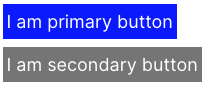
One of the great things about styled components is that you can use props to style your components dynamically. For example, let's say you want to change the background color of your StyledButton component based on the type prop. You can do the following:
const StyledButton = styled.button`
  background-color: ${(props) => (props.type === 'primary' ? 'blue' : 'grey')};
  color: white;
  font-size: 18px;
`
Now you can use this component simply by:
<StyledButton type="primary">I am primary button</StyledButton>
<StyledButton>I am secondary button</StyledButton>
This will generate the below output:

Step 5: Use themes and global styles
Styled components also provides a way to define global styles and themes that can be used throughout your application. To do this, you'll need to create a <ThemeProvider> component and wrap your application with it.
First, create a theme.js file and define your theme object:
export const theme = {
  primaryColor: 'blue',
  secondaryColor: 'grey',
  fontSize: '18px',
}
Then, in your root component, import the ThemeProvider component and wrap your application with it:
import { ThemeProvider } from 'styled-components'
import { theme } from './theme'

function App() {
  return <ThemeProvider theme={theme}>{/* Your application components go here */}</ThemeProvider>
}
Now, you can access the theme object in your styled components using the theme prop:
const StyledButton = styled.button`
  background-color: ${(props) =>
    props.type === 'primary' ? props.theme.primaryColor : props.theme.secondaryColor};
  color: white;
  font-size: ${(props) => props.theme.fontSize};
`
This basically will generate same output as before :
Conclusion
That's it!\
You now know the basics of how to use styled components in your React applications.
Styled components is a powerful tool that makes it easy to style your components in a modular and organized way. With the ability to use props to style dynamically and define global styles and themes, styled components gives you a lot of flexibility in how you style your components.
Read more from official docs
Happy styling!